

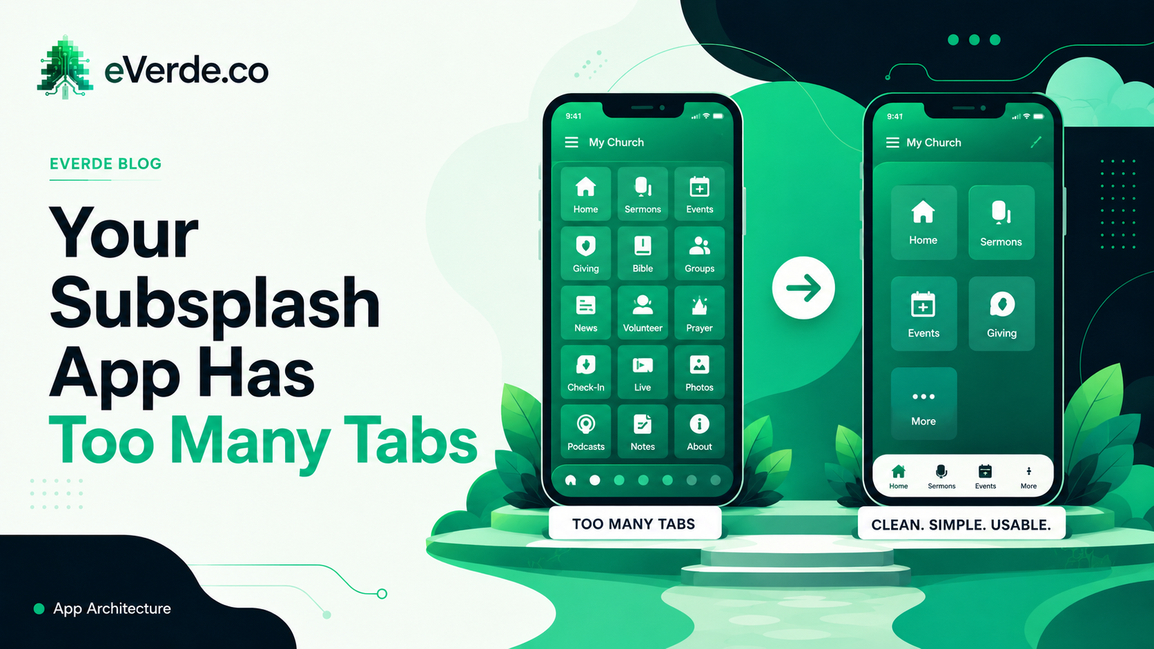
Open your church app right now. Count the tabs at the bottom. If there are more than five, your members are ignoring most of them. Here is how to fix that.
The Tab Problem
Most churches build their Subsplash app the same way they build their website: by adding things as needs arise. The youth pastor wants a tab. The women's ministry wants a tab. The missions team wants a tab. The worship team wants a tab. Pretty soon you have 9 tabs and the most important ones are buried.
Tabs are premium real estate. They are the first thing a member sees when they open the app. Every tab you add dilutes the ones that were already there. When everything is a tab, nothing is findable.
The Banking App Test
Think about your banking app. It has maybe four or five tabs at the bottom. Dashboard. Transfers. Payments. Messages. Settings. That is it. Everything else lives inside those tabs.
Your bank does not give credit cards their own tab and mortgages their own tab and savings accounts their own tab. They organize by what you are trying to do, not by what department runs it.
Your church app should work the same way. A member opens the app because they want to do something: watch the sermon, register for an event, find their small group, give, or check what is happening this week. Those actions should each be one tap from the home screen.
How I Structure Custom Subsplash App Navigation
I typically use four to five tabs for a custom Subsplash app build:
Home: the dashboard. This is the Weekly Update, the live stream during service, the current sermon series, and the one or two things you want every member to see this week. This is the banking app's dashboard.
Connect: groups, events, serving opportunities, and next steps. Everything that helps a member go deeper lives here. Not in five separate tabs. In one place organized by what the member is trying to do.
Media: sermons, podcasts, video content, worship playlists, reading plans. All your content in one library.
Give: one tap to give. No friction. This earns its own tab because it is the one action you never want buried behind a menu.
More: everything else. Staff directory, locations, prayer requests, settings, links to external tools. This is the junk drawer and that is fine. It exists so nothing else has to be a tab.
The Menu Alternative
Some churches push back on reducing tabs because they want every ministry visible. The compromise is a custom navigation menu inside the Home tab. This is a grid of icons or a scrollable row that links to ministry-specific content without burning a tab on it.
The difference matters. A tab says "this is always visible, always one tap away." A menu item says "this is available when you go looking for it." Most ministry content belongs in the second category. Members do not open the app to browse your missions page. They open it to check the sermon or register for something. Make the frequent actions tabs. Make everything else findable through the menu.
When to Restructure
If your app has been live for more than a year and engagement is low, navigation is probably the problem. Not the content. Not the platform. The architecture.
A custom Subsplash app restructure takes about two weeks of Discovery and Building. We map how members actually use the app, identify the top five actions, and rebuild navigation around those. The content stays the same. The architecture changes. Engagement goes up because people can finally find things.