Product Primer
Designing Evergreen Presence is the practice of building digital systems that align tools, message, and rhythm so presence feels as solid as mission. Not trendy. Not reactive. Not patchworked. Aligned.
The Story
Turning Point Community Church did not need a prettier website. They needed alignment.
Like many churches, they had content. They had events. They had tools. They had announcements. But everything lived in slightly different places, followed slightly different logic, and required staff to remember where everything was supposed to go. The result wasn't chaos, but it wasn't clarity either. It was effort-heavy communication.
The first shift was philosophical.
Instead of asking, "What pages do we need?" we asked, "What is the central nervous system of this church's digital presence?"
That question led to architecture.
Phase 1: The Website as a Living System
We rebuilt the website not as a collection of pages, but as a structured system. Instead of static announcements scattered across email, social, and bulletin formats, we centralized communication around a Weekly Update model, a living hub page that becomes the authoritative source of truth.
Every major communication pathway points back into structured systems: events are actual Subsplash events, not paragraphs of text. Registrations connect directly to structured forms. Navigation is audience-aware. Layout is consistent and repeatable. The app and website mirror one another intentionally.
We also built a Connection Point hub that functions like a dashboard. Church apps should work like banking apps, people don't open them to read your history; they open them to check their balance and take action. The same thinking was applied to the website. Action first. Clarity first. Authority first.
Snappages was used not as a drag-and-drop toy, but as a structured publishing platform. Blocks were intentional. Color hierarchy was restrained. Sections repeat predictably. The design supports the system instead of competing with it.
Phase 2: Everything Is an Event
One of the core principles implemented at TPCC: where two or more are gathered, there's a Subsplash event.
If people are physically gathering, it belongs in the system as a structured event. Not just a paragraph announcement. An event has metadata. It has time, location, category, reminders, and downstream syndication into the app and calendar. That structure reduces duplication and eliminates drift.
When communication flows from structured events instead of text blocks, something powerful happens: your app, website, and calendar stay aligned without constant manual correction.
That shift alone changes staff workload.
Phase 3: The Custom Bible Reading Tool
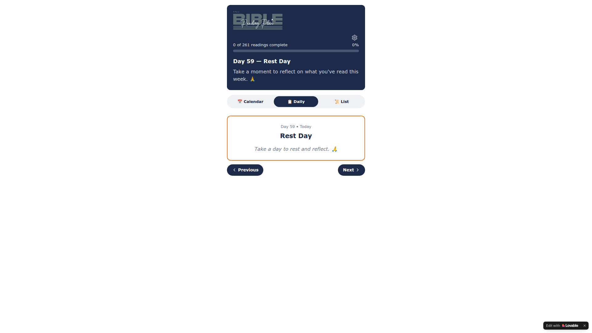
Instead of simply linking to an external platform, we extracted the XML reading plan file used inside their app and built a web-based version that integrates cleanly into their website. Then we connected it to the YouVersion API so that daily readings remain accessible, structured, and easy to follow, without requiring members to jump between disconnected systems.
This tool keeps engagement inside the church's ecosystem. It leverages existing app data instead of recreating it manually. It provides daily structure without duplicating content. And it reinforces the idea that the website is not static, it is functional.
This is the difference between a website that informs and a website that participates.
Phase 4: App Architecture That Feels Intentional
The app structure was refined around engagement. We reduced unnecessary tabs. We centralized action-based forms under a Connect model. We treated media as its own dedicated environment. And we ensured that the Bible remained accessible without competing with core engagement pathways.
The goal was not to add features. The goal was to reduce friction.
Every form, event, and reading plan was intentionally placed within a structure that made sense both to first-time guests and long-time members.
The Work
Outcome
The most important result of the TPCC project is not visual. It is operational.
Staff no longer duplicate information across five platforms. Updates happen in one place. The app reflects reality automatically. The website stops drifting out of sync. Communication becomes predictable.
Predictability builds trust. And trust builds usage.
Digital presence now feels as solid as their mission. Not trendy. Not reactive. Not patchworked. Aligned.
Check it out yourself
Ready to Design Your Evergreen Presence?
Let's talk about what's possible when systems are built to last.