
The Engagement Formula: Why Your Church Website Isn't Converting
 Reed VerdesotoDigital Systems Architect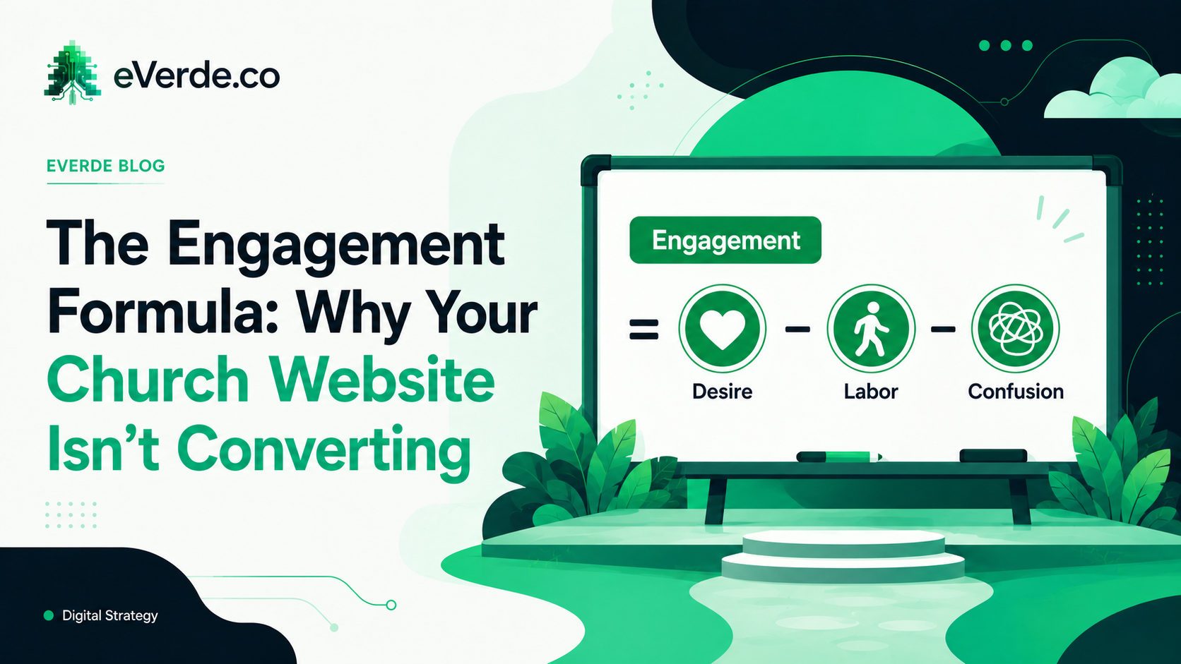
Every page on your church website is doing one of two things. It is either pulling someone closer to taking action, or it is pushing them away. There is no neutral. There is no "good enough." Pages either work or they leak.
I have audited hundreds of church websites. The pattern is always the same. The church cares deeply about what they offer. They pour time into the copy, the photos, the events. But the pages themselves are structured in ways that fight against the very engagement they are trying to create.
So I started naming the problem. And the problem has a formula.
The Engagement Formula
Engagement equals Desire minus Labor minus Confusion.
That is it. Every page on your website, every screen in your app, every landing page for an event follows this equation. If you understand it, you can diagnose almost any engagement problem your church is facing online.
Let me break it down.
Desire: Does this page make someone want what you are offering?
Desire is the emotional pull. It is what makes someone pause scrolling and actually read. It is the photo that looks like real community. It is the headline that speaks to a felt need instead of an internal program name. It is the reason someone would tap "Learn More" instead of hitting the back button.
Most church websites do not struggle with desire at the mission level. Your church has real community, real transformation, real belonging. The problem is that the website does not communicate that. It communicates org charts and program schedules.
A page titled "Small Groups" creates almost no desire. A page titled "Find Your People" creates desire. Same ministry. Same content. Completely different engagement.
Labor: How much work does a visitor have to do?
Labor is friction. Every click, every scroll, every form field, every extra page between someone and the thing they want is labor. And labor kills engagement faster than anything else.
Here is where most church websites fail silently. The information exists somewhere on the site. But getting to it requires three clicks through a menu, scrolling past twelve paragraphs of context, and then finding a registration link buried at the bottom of the page.
If someone has to work to engage with your church online, most of them will not. They will just leave. You will never see it in your analytics because you cannot measure the people who gave up. You can only measure the ones who pushed through. And you are building your strategy around survivors, not your actual audience.
The fix is architectural. Put the next step above the fold. Reduce form fields to the minimum. Make buttons obvious. Eliminate unnecessary intermediate pages. Every extra step you add is a percentage of your audience that disappears.
Confusion: Can someone figure out what to do in under five seconds?
Confusion is the silent killer. It is not dramatic. Nobody emails your church to say "your website confused me." They just leave. They open the page, scan it for two or three seconds, do not immediately understand what they are supposed to do, and they are gone.
Confusion comes from competing calls to action. It comes from pages that try to serve three audiences at once. It comes from navigation labels that use insider language. It comes from layouts where the eye has nowhere to land.
I see this constantly on church homepages. There is a welcome video, a sermon embed, an event carousel, a giving button, a staff directory link, a blog feed, and a prayer request form all competing for attention on a single page. The church thinks they are being thorough. What they are actually doing is creating a page where nothing gets clicked because everything is fighting for priority.
One clear action per page section. One primary audience per page. One obvious next step. That is how you eliminate confusion.
Applying the Formula
Every page on your site has a job. A homepage should increase desire and reduce confusion. An event page should reduce labor and make registration effortless. A giving page should reduce confusion and make the process feel secure and simple. An audience page (like "I'm New") should increase desire by showing what the experience actually looks like.
When a page is underperforming, run it through the formula. Is desire high enough? Is labor low enough? Is confusion eliminated? The answer is almost always that one of those three is broken. Fix that one thing and engagement moves.
Why This Matters for Your Subsplash Setup
If you are running your church on Subsplash, this formula applies to every SnapPages layout, every app tab, every event listing, and every form. The platform gives you the tools. Architecture determines whether those tools produce engagement or just fill space.
This is what ReedVerde builds. Not just websites. Systems where every page follows the engagement formula, every pathway reduces friction, and every section earns the next click.
Run your homepage through the formula right now. Count the competing calls to action. Measure how many clicks it takes to register for your next event. Ask someone who has never visited your church to find your service times in under ten seconds.
If they cannot, the formula is telling you exactly where to start.
Originally published on reedverde.com